

12.1 million tons of furniture dumped in a single year. 80.1% of it straight into landfills. A $200 sofa outperforming a $3,000 one because someone hung curtains at the right height. Artwork placed 57 inches from the floor; the same standard the Smithsonian uses. A $20 pack of warm-white bulbs transforming an entire living room overnight. A UCLA study linking household clutter directly to elevated cortisol in the people sleeping there. Nine of these fifteen fixes cost literally nothing. The line between a home that looks expensive and one that looks cheap was never about the budget; it was about fifteen mistakes nobody told you to stop making.
Your home has a lot to say about you before you ever speak. Unfortunately, most of our homes are communicating something we never intended — misaligned proportions, harsh overhead lighting, and furniture marooned on bare floors.
According to the U.S. EPA, Americans disposed of 12.1 million tons of furniture and furnishings in 2018 alone. In 1960, that number was 2.2 million. That is an enormous volume of material cycling through American homes. While some items are discarded because they broke, much of that waste could be avoided with better spatial planning. Poor design choices compound. One wrong furniture purchase often triggers another to compensate. Before you know it, you find yourself starting over instead of diagnosing why the previous effort failed.
Here is what the home-decor industry won’t tell you. The difference between a space that looks luxurious and one that looks cheap rarely comes down to money. What matters is whether a handful of fundamental design flaws in the way a space was planned and laid out were intentionally ignored. A $200 sofa in a room with proper scale, layered lighting, and a correctly sized rug will outperform a $3,000 sofa surrounded by nothing.
Researchers at UCLA’s Center on Everyday Lives of Families discovered a direct correlation between cluttered, disorganized living environments and increased levels of cortisol (stress hormone) — specifically among women in dual-income couples. Your home is not simply a backdrop for life — it actively shapes your mental health. How your home is designed affects mood, perception, and the emotional weight you carry through the day.
These are not vague tips. These are 15 specific, research-backed mistakes that devalue any space — with low-cost fixes for each. Some will confirm what you’ve suspected for years. Others will change how you see your living room tonight.
1. The Rug That Is Too Small for the Space It Occupies {#the-rug-thats-too-small-for-the-room}
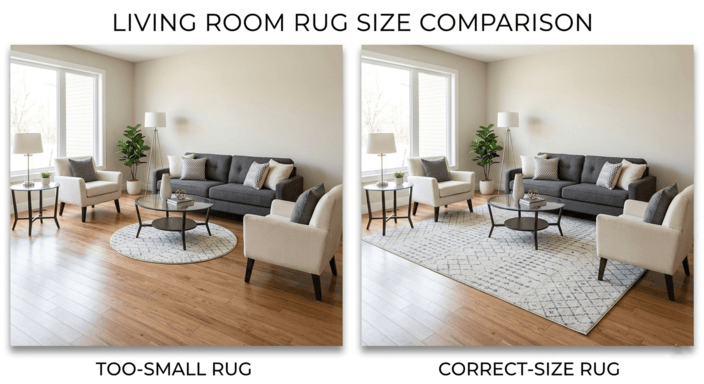
Interior designers agree almost unanimously: the most frequent home design mistake they encounter is a rug that is too small for the room or improperly scaled to the furniture. Gideon Mendelson, an interior designer based in New York City, told House Beautiful that clients most often buy rugs far too small for their furniture groupings. Ideally, Mendelson notes, a rug should anchor a furniture grouping — covering at least the rear legs — rather than floating in the center of the room. Meghan Jay, an interior designer also interviewed in House Beautiful, further supported this by stating that a larger rug instantly makes a room feel more spacious and more cozy.
Homeowners commit this mistake for psychological and economic reasons. Good-quality rugs can be expensive per square foot, so it makes economic sense to purchase the smallest possible rug. However, the smallest rug that technically “covers” the seating area will visually disconnect each piece from the floor plan — legs of sofas, coffee tables, and chairs appear to float on bare floors like unstaged showroom furniture. Emily Henderson, one of the most influential interior designers online, dedicated an entire article — “Design Mistake #2” — to this exact problem. Henderson noted that selecting a rug must be done so that it is proportional to the length and width of the sofa, establishing a minimum baseline for size selection.
The Vibe List Fix: The rule is simple: every major piece of furniture should have at least its front legs on the rug. Most living rooms require an 8×10 rug, whereas larger rooms require a 9×12. While a larger rug may exceed your initial budget, natural fibers at affordable prices close the gap. Jute and sisal rugs provide excellent bases for any decorating style. Upgrading from a 5×7 rug to an 8×10 sisal rug typically costs less than $150. Once you establish proper scaling, the aesthetic improvement is immediate.
2. Placing All of the Furniture Along the Walls {#pushing-every-piece-of-furniture-against-the-wall}
Almost universally, homeowners push furniture against walls to “save” floor space. While this makes sense in tight quarters, it creates the opposite of its intended effect — a waiting room, not a living space.
Interior designer Regan Billingsley told Real Simple that lining furniture against every available wall generates rigidity and strips a space of warmth. By moving furniture away from walls and configuring it to promote interaction, designers create a warm, inviting environment conducive to conversation and smooth traffic flow.
When every piece sits flush against the walls, the center of the room becomes a dead zone — an empty expanse that occupants instinctively avoid. Even when properly furnished, this configuration makes the room feel smaller than it is. Moving your sofa away from the wall by 6–12 inches and adding a slender console or sofa table in its place instantaneously establishes depth, offers additional surfaces for lamps or decorative objects, and lends a sense of intentionality — similar to museums and galleries — to your room.
The Vibe List Fix: Move your largest piece of seating (typically your sofa) 6–12 inches away from any surrounding walls. Place a thin console or sofa table in the space created behind the sofa. Configure accent chairs at angles toward the sofa rather than parallel to adjacent walls. Arrange furniture as if it were a conversational circle — pieces should interact with each other, not with walls.
3. Using Only a Single Overhead Light Source {#relying-on-a-single-overhead-light}
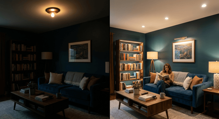
Few home design mistakes degrade a room’s appearance faster than this one. A single overhead fixture — especially with a cool-white bulb — flattens shadows and eliminates the visual contours that give objects depth. Furniture looks flat, skin tones wash out, and the room reads like an office corridor.
A 2021 study published in Building and Environment found that occupants’ perceptions of mood and cognitive function were impacted by illuminance level and correlated color temperature. Specifically, researchers determined participants exhibited more positive mood states when exposed to moderately lit spaces (>300 lux) with warm lighting (correlated color temperature ≈ 3000K) as opposed to brightly lit spaces (>500 lux) with cooler overhead lighting.
Interior designers counter single-source flatness with layered lighting: ambient lighting (general illumination), task lighting (focused illumination for reading or cooking), and accent lighting (highlighting artwork or architectural features). Together, these techniques create perceived depth, warmth, and visual stimulation that a single overhead fixture cannot achieve.
The Vibe List Fix: Provide at least three distinct lighting sources at varying heights for your main living area. Include at least one floor lamp near or behind the sofa, at least one table lamp on a side table, and at least one accent light source (e.g., a picture light above artwork, LED strip lighting behind an entertainment console, or candle clusters). Replace every overhead bulb with warm white (2700K–3000K). Total cost can be under $100. Guests will notice the difference the moment they enter your home.
4. Hanging Art and Mirrors Far Too High {#hanging-art-and-mirrors-too-high}
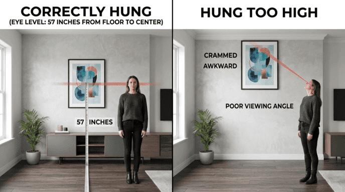
Art galleries and museums worldwide hang artwork so that the center of each piece sits at 57 inches from the floor — average human eye level. The National Museum of Modern Art and the Smithsonian Institution are two prominent examples of organizations adhering to this standard, as documented by Apartment Therapy. According to Apartment Therapy, 57 inches represents the standard distance for hanging pictures.
Most homeowners hang art and mirrors well above this standard, centering pieces horizontally on the wall rather than vertically at eye level — positioning them near the upper quarter of the wall. This creates an undesirable condition wherein viewers must raise their eyes to interact with artwork and mirrors, sending a subconscious message that ceilings are lower than they are.
House Beautiful quoted interior designer Steven Graffam who explained that paintings and artworks should be hung at 57–60 inches above floor level measured to center line — and televisions suffer similarly — creating undesirable neck-straining angles for viewers.
The Vibe List Fix: Measure 57 inches from the floor and locate where that falls on your wall as your reference point for center-line placement. Position your artwork so that the center line falls on the 57-inch mark. Above sofas, the bottom edge of frames should fall 6–8 inches above sofa backs. Old nail holes from previous incorrect placements can be filled with spackling paste and wiped clean with a wet sponge after drying.
5. Purchasing Identical Matching Furniture Sets {#buying-matching-furniture-sets}
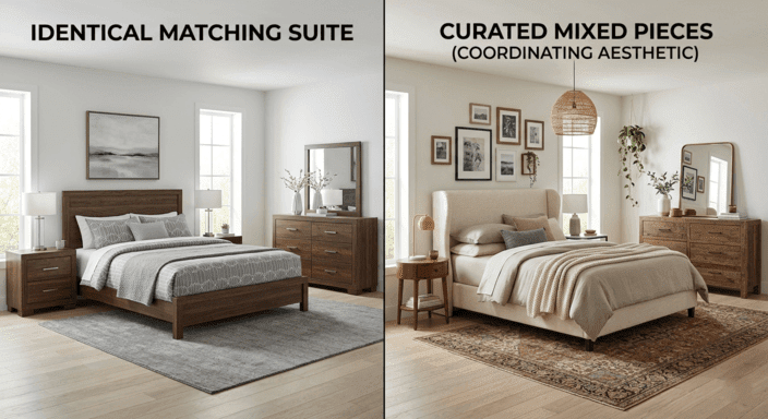
Matching furniture collections — sofas, loveseats, coffee tables, and accent pieces from the same manufacturer in the same finish — remain bestsellers. Unfortunately, they are also one of the clearest markers of generic, assembly-line design.
Gillian Segal is an interior designer featured in House Beautiful who stated: “Variety is the spice of life, and it never feels welcoming when it looks like you have all the items from one collection in your space.” Segal believes that spaces devoid of variety feel cold and unwelcoming — essentially catalog-page settings.
Ryan Saghian is an interior designer who writes for Forbes and has asserted his belief in creating an aesthetic “rawness,” as he believes rooms should evolve naturally over time through items that tell stories. Saghian further explains in Forbes how coordinating pieces through shared color palettes, material families, and eras avoids one of the most common home design mistakes — the matching set — and instead conveys personality.
The Vibe List Fix: If you currently possess a matching collection, create visual interest by incorporating at least one piece acquired through non-standard means — an antique side table, an upcycled accent chair, or a vintage find from a flea market or estate sale.
6. Ignoring Window Treatments or Hanging Them Incorrectly {#ignoring-window-treatments}
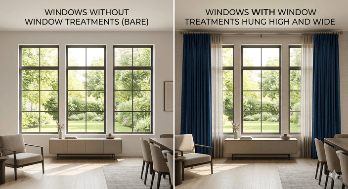
Few things make a room look unfinished faster than missing or poorly hung window treatments. Interior designer Regan Billingsley told Real Simple that drapes hung in the wrong position, cut too short, or lacking sufficient volume can cause a space to appear unpolished and disrupt the visual flow.
The best practice, as described by Emily Henderson, is to install curtain rods at least midway between the top of the window frame and the ceiling — or better yet, directly against the ceiling — to make walls appear taller. In addition, curtains should extend four to ten inches outside each side of the window frame, allowing them to frame the window when opened without obstructing the view.
Another common problem: curtains that are too short. Curtains falling several inches above the floor create the same visual discomfort as wearing pants that are too short — something doesn’t fit right. Curtains should either brush against the floor (“kiss” the floor, according to Billingsley) or spill over slightly for a more dramatic effect.
The Vibe List Fix: Install curtain rods 4–6 inches from the bottom of your ceiling (not on top of your window) and ensure they protrude 6–8 inches on each side of your windows. Buy curtains that meet just at the floor. If there isn’t a standard length to accommodate your ceiling height, purchase panel-length curtains slightly longer than necessary and have them shortened by a local seamstress for approximately $15–$25 per panel.
7. Buying Trendy Instead of Classic on Major Items {#buying-trendy-instead-of-classic-on-major-items}
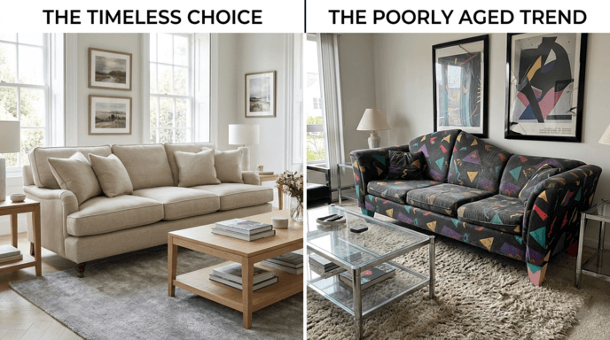
Interior designer Kathy Kuo told Real Simple that skimping on major furniture — sofas, chairs, beds, dining tables — is a false economy. Cheaper “fast furniture” saves money upfront but demands replacement within a few years, erasing any initial savings.
As reported by the EPA, production and disposal of furniture and home furnishings increased dramatically since 1960. From 2.2 million tons produced in 1960, the amount rose to 12.1 million tons in 2018. Additionally, 80.1% of all discarded furniture ends up in landfills. Most of this waste comes from trend-chasing — buying a sofa because it went viral on social media instead of investing in durable furniture that will look good for a decade.
Ryan Saghian told Forbes that he personally avoids following every new trend in his home, stating that thoughtful curation produces spaces that feel genuine and enduring. Industry-wide, designers agree that consumers should spend on quality foundation pieces (sofa, bed frame) and then use affordable accents (throws, pillows, rugs) to express personality.
If you’ve invested in time-tested basics for clothing, the same rule applies to your home. High-quality basic furniture gives homeowners the flexibility to express themselves via decorative elements — pillows, rugs, artwork — and replace those easily as often as desired.
The Vibe List Fix: Invest in high-quality, neutral-colored (beige, gray, navy, black, white), clean-silhouette furniture free from trend-specific details on your next major purchase. Show your individuality via pillows, throws, art, and decorative objects — items that cost significantly less and can be swapped out as frequently as desired.
8. Placing TVs Directly Above Fireplaces {#placing-tvs-directly-above-fireplaces}
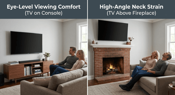
No matter how many forum debates this topic generates, the answer is clear: mounting a TV above a fireplace is a mistake, ergonomically and aesthetically. Craning your neck upward for extended viewing sessions strains the cervical muscles. The center of a television’s viewing area should line up with the viewer’s eye level while seated — approximately 42 inches from the ground for most adults.
Fireplaces typically sit at 50–60 inches from the ground. Mounting a TV above a fireplace places its center at 60–70 inches — approximately 18–28 inches higher than the recommended ergonomic viewing height. Prolonged viewing at this angle contributes to chronic upper-back, shoulder, and neck discomfort.
From an aesthetic standpoint, mounting a TV directly above a fireplace also creates a stacked-focus problem. Both the fireplace and the television vie for attention as the primary focal point; neither is enhanced by this configuration.
The Vibe List Fix: If your living room layout allows it, mount the TV on a media console or elsewhere at a comfortable viewing level (42 inches from the floor to the center of the screen). If the fireplace wall is your only option, consider a motorized mount that tilts the TV downward or an articulated bracket that brings the TV closer to the viewer and reduces its tilt angle.
9. Neglecting Scale and Proportions {#neglecting-scales-and-proportions}
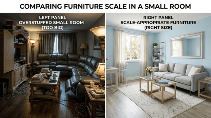
Scale refers to how big or small a given piece of furniture is compared to the room it occupies. Proportion refers to how the pieces relate in size to one another. When either is off, it is difficult for anyone except trained designers to articulate why a room feels awkward.
Gideon Mendelson told House Beautiful that most homeowners cram too much furniture into rooms. His solution: pair fewer large, heavy pieces with lighter, elegantly scaled accents rather than filling every inch with mid-sized items. Meghan Jay also commented in House Beautiful that scale can be tricky, admitting it is one of the hardest design concepts for non-designers to apply successfully.
Common examples of poor scaling include an oversized sectional stuffed into a small living room (making the room appear engulfed) or minuscule furniture scattered throughout a large room (making it appear vacant). Both cases send the same message: measurements were not taken before buying.
The Vibe List Fix: Before buying any new furniture, measure your room and draw a rough sketch of your floor plan. Apply blue painter’s tape on the floors where furniture pieces will reside and live with that tape-lined mockup for 24 hours before making final decisions. Pay special attention to passage paths — you want at least 30 inches of free path along walkways and at least 18 inches between the edge of a sofa and a coffee table.
10. Using Too Many Throw Pillows or Only One Type of Pillow {#using-too-many-throw-pillows-or-only-one-type-of-pillow}
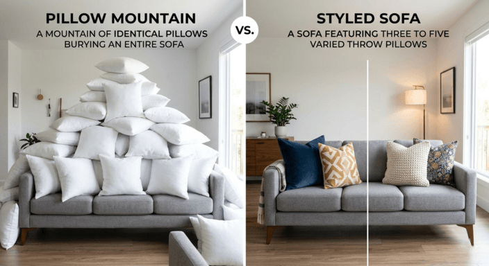
A sofa buried under throw pillows signals effort without intention — as though “more pillows” automatically means “more style.” Arranging pillows is subject to the same rules governing all design decisions: variation, proportion, and restraint.
According to The Spruce, purchasing sets of matching throw pillows is one of the most common home design mistakes that lead to poorly styled couches. The Spruce notes that having throw pillows with fabric matching the sofa creates a monotonous, catalog-like appearance. Contrast provides the solution: pillows should incorporate differing textures, patterns, and sizes to add visual appeal.
An optimal arrangement incorporates an odd number (typically three or five) of pillows in two to three sizes. Begin by positioning two large pillows (20–22 inches) at each end of the sofa as anchors, followed by one or two medium pillows (18 inches) in contrasting patterns, and finish with one lumbar pillow centrally located for visual separation and functional lower-back support. Include differing textures — combine a linen cover with a velvet cover, or mix woven textures with smooth cotton.
The Vibe List Fix: Reduce your total pillow count to three to five. Include at least two different sizes, at least two different textures, and at least one differing pattern. Remove any pillow that features fabric identical to your sofa. If all pillows were purchased as a set, remove at least two and replace them with contrasting options — thrift stores and discount retailers offer pillow covers for $15–$25.
11. Ignoring the Ceiling Entirely {#ignoring-the-ceiling-entirely}
The majority of ceilings get ignored entirely in home design, remaining a simple builder-grade white paint job no matter what happens beneath them.
Researchers at Johannes Gutenberg-Universität Mainz, whose findings were published in PLOS ONE, discovered that bright paint makes interior surfaces appear farther away, effectively altering spatial perception. While participants’ color preferences indicated that white ceilings were generally preferred, the research confirmed that adjusting ceiling luminance relative to wall color significantly changes perceived room dimensions. A ceiling that shares the same color — or a slightly lighter version of the wall color — can create a “cocooning” effect, making the space feel cozier and more enveloping than a stark white ceiling.
In addition to these findings, the growing popularity of “color drenching” — painting walls, ceiling, and trim the exact same color — has been widely documented. Forbes identified color drenching as one of the major interior design trends of 2026, noting that designers say it helps blur a room’s boundaries and create a more unified look. The 2026State of Home DesignReport fromApartment Therapy, based on a survey of 140 designers, also supports this trend.
The Vibe List Fix: If you’re not ready to fully commit to color drenching, use a ceiling that is one or two shades lighter than your wall color instead of pure white. This softens the transition between wall and ceiling and eliminates the harsh visual line that white produces against a colored wall. For a bolder approach, paint your ceiling the same color as your walls. For rooms measuring less than 150 square feet, a single color for both walls and ceiling creates a larger visual space by removing obvious boundaries.
12. Ignoring Lighting Color Temperature in Interior Design {#what-is-wrong-with-color-temperature}
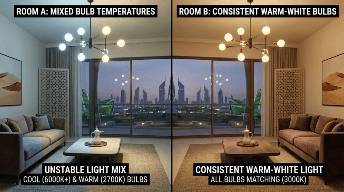
As House Beautiful designer Meghan Jay points out, when clients have light bulbs in various color temperatures, it visually disturbs the room — some parts feel bathed in cool light while others feel warm.
Bulb temperature is measured in Kelvins (K). Warm white bulbs fall between 2700K and 3000K and emit yellowish light similar to incandescent bulbs and candlelight. Neutral white bulbs fall between 3500K and 4100K and emit light close to daylight. Cool white bulbs, above 5000K, produce bluish-white light reminiscent of fluorescent lighting. When bulbs of different temperatures share a room, they send conflicting signals — one corner feels cozy, another feels clinical. Subconsciously, the space reads as unplanned.
According to research published in Building and Environment, warm lighting (3000K) at moderate illuminance levels was associated with better mood and greater relaxation. Conversely, cool lighting was linked to increased alertness and decreased comfort in residential environments. Additional research published in the International Journal of Environmental Research and Public Health confirmed that humans generally perceive warm white light as more pleasing and calming in living spaces.
The Vibe List Fix: Audit every lighting fixture in the room — overhead, table lamps, under-cabinet. If any bulb falls outside the 2700K–3000K range, replace it. This single change will greatly improve the overall cohesion of the space. Since most LED packaging includes color temperature, replacing multiple fixtures with warm white bulbs shouldn’t cost more than $20 per multi-pack.
13. Overcrowding Surfaces with Stuff {#overcrowding-surfaces-with-stuff}
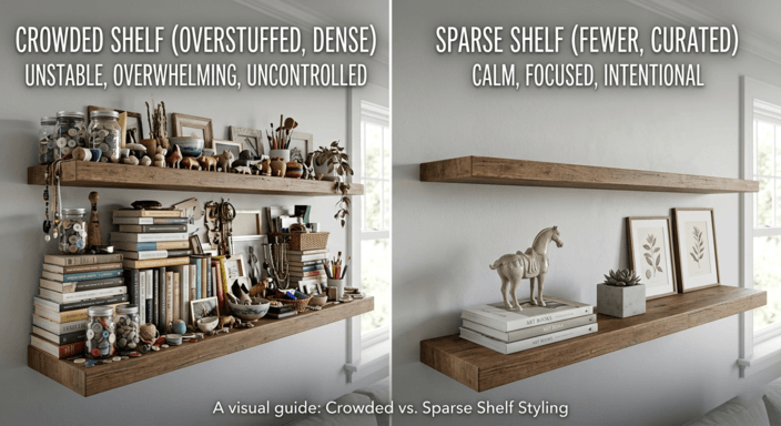
Most people unknowingly confuse a surface filled with decorative items with a well-designed surface. Every shelf, coffee table, side table, and mantle becomes a collection point for objects accumulated over time — candles, vases, photo frames, knick-knacks. While each individual item made sense at some point, collectively they create clutter and visual noise.
While there isn’t direct research linking excessive decoration to interior design aesthetics specifically, researchers at UCLA did study clutter and cortisol. The UCLA study found that women living in homes with higher numbers of household objects demonstrated flatter cortisol slopes during the day — a pattern associated with poor physical health outcomes and elevated feelings of stress.
House Beautiful designer Chrissy Jones noted that too many objects left out on surfaces create visual clutter that disrupts a sense of peace. Jones recommends prioritizing high-end simplicity — designing spaces that are elegant, functional, and bring a sense of balance to daily life.
The Vibe List Fix: Use the rule of threes on each surface. Create groupings of three (or five) objects that differ in height, texture, and form. Remove everything else. A coffee table should have at most two stacked books, one small object, and either a candle or a potted plant. Shelves need enough empty space between objects. If you wouldn’t place the item in a beautifully arranged retail setting, don’t place it on an exposed surface.
14. No Greenery {#no-greenery}
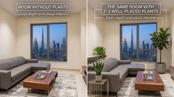
A space devoid of living vegetation looks unfinished in ways that aren’t easy to define but are instantly recognizable. Living plants add organic texture, color variation, and a presence of life that no non-living object can replicate.
Researchers published a paper titled “Interaction with Indoor Plants May Reduce Psychological and Physiological Stress by Suppressing Autonomic Nervous System Activity in Young Adults” in the Journal of Physiological Anthropology (2015). Their results revealed that individuals engaged with living indoor plants exhibited reduced physiological (blood pressure) and psychological (heart rate) stress responses compared to individuals performing computer tasks. Participants engaged with plants also reported a greater sense of comfort and naturalness.
A subsequent meta-analysis published in the International Journal of Environmental Research and Public Health (2022) supported these findings, indicating that indoor plants generally produce positive effects on both physiological and cognitive processes.
Greenery addresses a unique design challenge: breaking up sharp angles and solid forms. Spaces composed primarily of rectangular furniture and smooth surfaces benefit greatly from plants that introduce organic curves, softer shadow patterns, and visual movement.
The Vibe List Fix: Choose 2–3 plants positioned at varying heights — a tall floor plant in a corner, one medium-sized plant on a table or shelf, and one trailing vine on top of a bookcase or hanging planter. Low-light-tolerant options include Pothos, Snake Plants, and ZZ Plants, which grow slowly and require water approximately every one to two weeks. If you’ve historically struggled keeping plants alive, consider displaying one high-quality preserved botanical arrangement or dried eucalyptus stems.
15. Mistaking Empty Space for Wasted Space — Designing Rooms Without Negative Space {#negative-space}
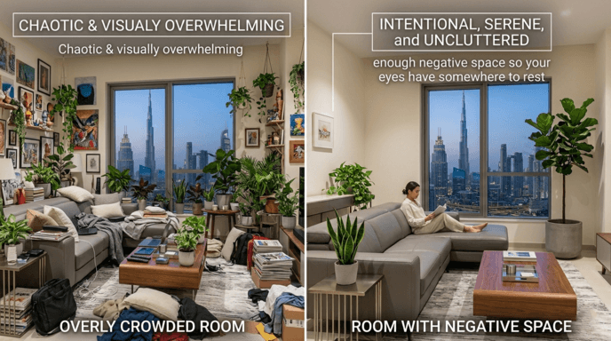
Negative space — the empty space surrounding objects — is not unnecessary. It is part of the design. It allows our eyes to rest, provides each item in a room with space to exist, and keeps rooms from feeling overbearing regardless of size.
Researchers conducted a study published in PLOS ONE in 2018 examining how surface brightness impacts spatial perception. They concluded that brighter painted surfaces appear farther away than darker ones. This confirms a fundamental design principle: light, uncluttered spaces look bigger than dark, cluttered ones. The same applies to visual perception broadly — open surfaces, clear sightlines, and ample floor space all contribute to the perception of a larger, better-designed space.
Practically, this means not every wall needs artwork. Not every corner needs a lamp. Not every shelf must be filled. The blank space creates a focal point for the decorative elements that remain. One impressive piece of art on an empty wall has greater impact than multiple pieces covering every available inch.
The Vibe List Fix: Walk into each room and find one area you can leave entirely blank — an empty wall section, a clear corner, or an open shelf. Leave it blank. Your home will not look unfinished. It will look cleaner, bigger, and more thoughtfully designed. The best thing about negative space is that it costs nothing.
Quick-Reference Cheat Sheet: 15 Home Design Mistakes at a Glance
| # | Mistake | Why It Cheapens Your Space | The Vibe List Fix | Est. Cost | Difficulty |
|---|---|---|---|---|---|
| 1 | Rug Too Small | Furniture floats on bare floor; room feels disjointed and unanchored | Front legs on rug; upgrade to 8×10 minimum; jute or sisal for budget | $80–$250 | Easy |
| 2 | Furniture Against Walls | Creates rigid waiting-room feel; dead zone in center of room | Pull sofa 6–12 in. from wall; add console table behind it | $0–$60 | Easy |
| 3 | Single Overhead Light | Flat, harsh illumination; no depth or warmth; office-corridor feel | Add ≥3 light sources at varying heights; warm bulbs (2700K–3000K) | $50–$100 | Easy |
| 4 | Art/Mirrors Hung Too High | Ceilings feel lower; viewers must crane neck; subconscious discomfort | Hang at 57 in. center from floor; 6–8 in. above sofa backs | $0 | Easy |
| 5 | Matching Furniture Sets | Showroom look; zero personality; catalog-page aesthetic | Mix eras, materials, and sources; add one vintage or antique piece | $0+ | Easy |
| 6 | Wrong Window Treatments | Room appears unfinished, shorter, and visually unpolished | Mount rods near ceiling; extend 6–8 in. past frame; curtains kiss the floor | $30–$80 | Easy |
| 7 | Trendy Anchor Pieces | Disposable look; ends up in landfill within 3 years; 80.1% of furniture is landfilled | Invest in neutral, quality foundations; express personality via affordable accents | Varies | Medium |
| 8 | TV Above Fireplace | Neck strain (18–28 in. above ergonomic level); stacked focal-point conflict | Mount at 42 in. seated eye level; tilt mount if fireplace is only option | $0–$50 | Easy |
| 9 | Poor Scale/Proportion | Room feels either cramped or vacant; furniture looks random | Tape mockup on floor; 30 in. walkways; 18 in. sofa-to-table gap | $0 | Easy |
| 10 | Excess Throw Pillows | Cluttered; monotonous catalog-like look; no intentional design | 3–5 pillows; 2–3 sizes; mixed textures and patterns | $15–$40 | Easy |
| 11 | Ignoring the Ceiling | Harsh wall-ceiling line; lost cocooning effect; missed spatial illusion | Paint 1–2 shades lighter than walls; or color-drench entire room | $30–$60 | Medium |
| 12 | Mixed Bulb Temperatures | Conflicting warm/cool zones; room feels unplanned and chaotic | Standardize all bulbs to 2700K–3000K warm white | $10–$20 | Easy |
| 13 | Cluttered Surfaces | Visual noise; linked to elevated cortisol and stress (UCLA study) | Rule of threes on each surface; remove everything else | $0 | Easy |
| 14 | No Greenery | Sterile feel; no organic texture; no visual movement | 2–3 low-light plants at varying heights (Pothos, Snake Plant, ZZ Plant) | $15–$40 | Easy |
| 15 | No Negative Space | Overbearing; rooms appear visually smaller; no eye rest | Leave one intentional empty wall section, corner, or shelf per room | $0 | Easy |
The True Price Tag for Affordable Design Is Emotional — Not Financial
Every item on this list shares one trait: the price tag separating an “expensive-looking” room from a “cheap-looking” room is fundamentally about awareness of home design mistakes — and whether you’ve corrected them. Awareness of scale. Awareness of light. Awareness of proportion. Texture. Variety. Restraint.
Every fix on this list combined would cost less than one trendy piece of furniture destined for a landfill in three years. A rug that is large enough. Curtains installed at the correct height. Warm white light bulbs. Artwork at eye level. Plants. Space to breathe. None of these fixes require renovations. None require designers. Each requires attention. Intention. And the ability to view a space you’ve lived in for some time through new eyes.
Your home is already talking about you. These 15 fixes ensure the message it sends is the one you intend.
If you’re also improving your daily routines to produce quiet changes in your life, consider adding one home design adjustment per week. The cumulative effect of small, deliberate changes to your living environment mirrors the cumulative effect of small, deliberate changes to your daily habits. One change per week for four months produces a remarkable result. When you arrive home after work each day, the house you enter will be an entirely different place.
Frequently Asked Questions {#faq}
What is the one most impactful home design error to correct first?
Lighting. Replacing a single overhead light with multiple layers at different heights using warm white bulbs (2700K–3000K) creates the greatest immediate impact. Research published in Building and Environment in 2021 found that warm lighting with moderate illumination elicits more positive moods in residential environments.
How do I determine if my area rug is big enough?
Check whether at least the front two legs of all major seating pieces rest on the rug. An 8×10 rug is generally the minimum recommended size for most living spaces. If any part of your main furniture appears to float over the rug, the rug is too small. Interior designer Emily Henderson suggests that your rug needs to be proportional to the length of your sofa at minimum.
Can you ever justify mounting a TV above a fireplace?
From an ergonomic perspective, no. Ideally, the center of a TV screen should sit 42 inches from the ground, or at your seated eye level. Fireplace mantels usually position the screen 18–28 inches higher than that. If the fireplace is the only viable location, an adjustable tilt mount that angles the screen downward may help alleviate some of the neck strain caused by the elevated viewing angle.
How much should I budget for anchor furniture items?
While there is no universal dollar amount, interior designer Kathy Kuo suggests allocating more of your budget toward anchor pieces (sofas, beds, dining tables) than toward anything else in the room. These pieces define a room’s character and must last longer than other items. The best measure is cost per year of use: a $1,200 sofa lasting ten years costs less per year than a $500 sofa lasting two.
Does placing indoor plants in a room really make a difference visually?
Yes. Indoor plants contribute organic texture and color beyond creating visual interest. Scientific studies published in the Journal of Physiological Anthropology show that interacting with indoor plants reduces physiological and psychological stress. Plants also break up the long geometric lines produced by rectangular furniture throughout rooms.
What is color drenching, and should I try it?
Color drenching refers to painting walls, ceilings, and trim the same color, creating a “cocooning” or “boundaryless” feeling within a room. Both Forbes and Apartment Therapy identified it as a defining design element for 2026. The method works especially well in smaller rooms, where it visually erases the distinction between ceiling and walls, creating a sense of larger space.

