

Six million members in a subreddit dedicated to doors that lie to you. Three millimeters of letter spacing between ‘LET IT SNOW’ and an accidental holiday scandal. A solar panel installed underground, pretending to harvest light that will never arrive. A wheelchair ramp built to code that deposits its user at the foot of a staircase. None of these were made by amateurs; they were approved by entire chains of professional adults who looked at the finished product and said, ‘yes, this is okay.
Every door you’ve ever pulled when you should have pushed was someone else’s fault. Not yours.
Somewhere in a conference room, a designer approved a blueprint. A manufacturer stamped it into production. A contractor installed it. An entire chain of professional adults looked at the final product and said, “yes, this is okay.” Then you walk up to it. Do the wrong thing. And blame yourself.
That tendency to blame yourself is what Don Norman wants you to unlearn. Norman is a cognitive scientist. He used to be vice president of Apple. And he is the author of The Design of Everyday Things. Originally published under the title The Psychology of Everyday Things in 1988, the book has since become the most influential design text in four decades. Norman says that when a human being fails to operate an object correctly, the fault belongs to the designer, not the user. As he writes (from The Design of Everyday Things), “Good design is actually a lot harder to notice than poor design, in part because good designs fit our needs so well that the design is invisible, serving us without drawing attention to itself. Bad design, on the other hand, screams out its inadequacies, making itself very noticeable.”
Bad design has never been louder. And in today’s world of smartphones, Reddit, and an insatiable global appetite for absurdity, millions more people are noticing it than ever before.
The subreddit r/CrappyDesign has grown to roughly 6 million members and is one of the largest communities on Reddit. r/onejob (897,000 members), r/assholedesign (3.1 million members), and r/NotMyJob collectively draw tens of millions of monthly visitors who photograph, share, and laugh at funny design fails found in the wild. These posts spread from Reddit to Bored Panda, BuzzFeed, YouTube compilations, and Instagram reels, generating hundreds of millions of views per year. Pleated-Jeans posts a new roundup almost weekly. There is no limit to the global supply of poor design, nor any limit to the appetite for laughing at it. These are the worst design fails ever captured online, and collectively, some of the funniest design mistakes the internet has ever documented.
But why? Why does a solar-powered parking meter in an underground garage make you laugh? Why does a wheelchair ramp that leads to a staircase provoke something between outrage and joy? There is a peer-reviewed answer. Psychologists Peter McGraw and Caleb Warren at the University of Colorado Boulder developed the benign violation theory of humor, which they published in Psychological Science in 2010. The theory posits that humor occurs when three conditions are met: something violates your expectations of how the world works, the violation seems benign (no one is harmed), and both perceptions occur together. A design failure is the purest example of this theory. The design violates your expectation of function. The consequence is minimal (you pulled a door instead of pushing it; no one died). And your brain processes both facts at once and produces laughter.
These 20 entries are not random screenshots. They are the legendary ones: the design fails that went viral, created memes, generated threads with tens of thousands of upvotes, got shared so many times they became part of the internet’s collective folklore, and in several cases forced actual design changes. Each one includes real analysis of what went wrong, which design principles were violated, and why you find them funny. If you’ve ever scrolled through “you had one job” fails or crappy design fails online, you already know half of these by sight.
1. The Door That Needed a Manual {#1}
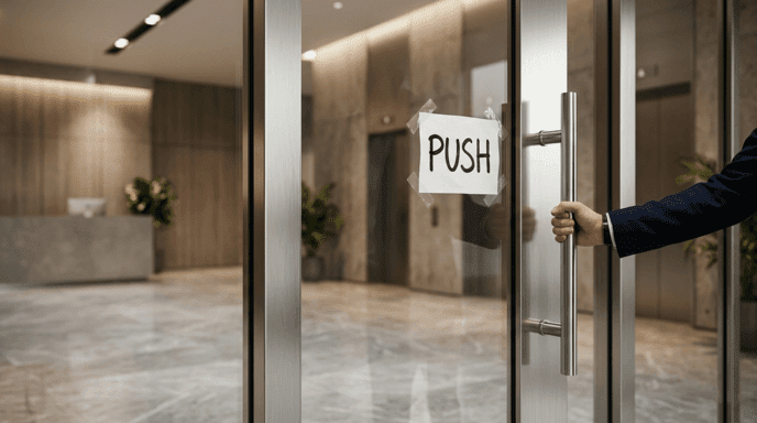
Every designer knows what a Norman Door is. Named after Don Norman by the design community, a Norman Door is any door where physical features indicate you should do the opposite of what is actually required. Flat plates say “push.” Vertical handles say “pull.” When you see a door with a handle that yells “pull me” and a sign that says “PUSH,” you have encountered a Norman Door.
Vox and 99% Invisible produced a video collaboration on this phenomenon that has been viewed over 10 million times on YouTube. In it, podcast host Roman Mars interviewed Norman about why these doors continue to exist. According to Norman, architects and designers value aesthetics over usability. They want their doors clean and symmetrical. The user pays the price.
This particular design principle is called an affordance, a term popularized by Norman himself. An affordance is the relationship between what an object looks like and what a person can do with it. A handle affords pulling. A flat plate affords pushing. When the affordance contradicts the required action, confusion follows. As Norman wrote, “Any time you see signs or labels added to a device, it is an indication of bad design.” A door that needs a sign telling you how to use it isn’t just a non-functional door; it is a sculpture with a hinge.
Norman Doors are everywhere. You’ve seen countless ones. That they persist decades after Norman wrote his book tells you everything you need to know about how slowly institutions change.
The Vibe List’s take: The original sin of bad design; and why this entry gets number one; is that Norman Doors embody everything that goes wrong when design ignores users: decision-makers ignoring creatives, creatives waiting too long to speak up, and customers waiting too long for change.
2. The Solar-Powered Underground Parking Meter {#2}
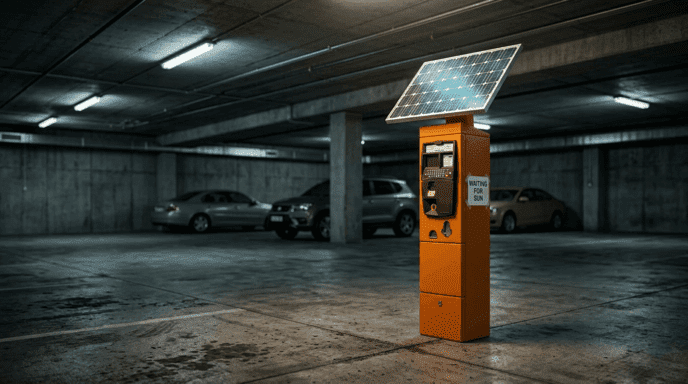
Someone installed a solar-powered parking meter in an underground garage where sunlight never reaches. The image went viral on r/CrappyDesign, producing thousands of upvotes and scores of comments trying to explain logically why it was done.
Some commenters speculated that the solar panel may still absorb light from the garage’s overhead fluorescents, which technically could produce a small amount of energy. However, indoor fluorescents produce a trivially small amount of electricity compared to direct sunlight, so the solar panel is pretending to provide energy while actually doing nothing useful. It is a decorative item passing itself off as an energy source.
This violates the principle of contextual appropriateness. A solar panel isn’t inherently bad. But it is bad when installed underground. The product works as designed. But in this environment, it’s useless. This distinction matters because most design failures are not caused by malfunctioning components, but by competent components placed in incompatible environments.
The Vibe List’s take: Installing a solar-powered parking meter in an underground garage is like bringing surfboards to landlocked countries. Technology works. Location doesn’t.
3. The Scissors Sealed Inside Packaging That Must Be Opened With Scissors {#3}
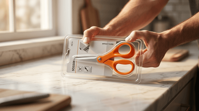
You purchased scissors. The scissors are packaged in clamshell packaging that must be opened with scissors. You didn’t have scissors; that’s why you bought scissors. This circular logic has been documented so often it’s now one of the most iconic images of design failure.
The root cause is a disconnect between the packaging team and the product team. The packaging team adds the same type of anti-theft clamshell to every product in a category, regardless of whether the product inside is the tool required to open the packaging.
This is not an individual fault. It persists because retail incentive structures prioritize reducing shoplifting losses over improving customer experience.
The Vibe List’s take: The scissors-in-clamshell failure is philosophy disguised as comedy. It’s a physical paradox sitting on retail shelves. The chicken-or-egg problem, but the chicken is Fiskars and the egg is four millimeters of polycarbonate.
4. The Bench That Tells You to Sit Down, Then Stabs You {#4}

Public benches serve one purpose: sitting. But many public benches feature protruding bolts, sharp decorative edges, or armrest dividers set so aggressively that sitting becomes a negotiation between comfort and pain. These photos frequently show up on r/CrappyDesign and r/HostileArchitecture.
Some of these are genuine design mistakes. Others are intentional, a practice called hostile architecture, where seats are designed to discourage skateboarding, sleeping, and sitting for extended periods. Armrest dividers on many park benches are also intentional, designed to stop homeless people from lying down. When these anti-homeless features also make the bench uncomfortable for the general public, the design has failed at two levels: comfort and basic human decency.
The Vibe List’s take: The bench that hurts you is both a design fail and a policy fail rolled into one uncomfortable piece of street furniture. When your city’s infrastructure denies residents accessibility and comfort, no amount of decorative metalwork will disguise the message.
5. The Bathroom Stall With a Window to the Soul {#5}
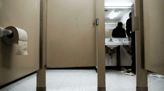
American bathroom stalls have never provided real privacy. The gaps between doors and frames are bad enough. When the stall won’t even lock, that’s a separate category of failure entirely.
Slate published an investigation into why American bathroom partitions are so poorly designed. The reasons include cost-cutting (less material means cheaper doors), building codes that may require ventilation gaps, the fact that wider openings make cleaning easier, and sheer manufacturing habit; companies have built them this way for decades, and nobody has demanded anything different. Millions of Americans use restrooms daily where accidental eye contact through the door gap is a near-certainty.
People traveling to America from Europe, Japan, or South Korea often report being shocked at the difference in restroom design. In those countries, most public restrooms provide privacy from floor to ceiling without any gaps. The American bathroom stall gap has become so well known that it’s now a meme in its own right.
The Vibe List’s take: The United States’ bathroom stall gap is not a design failure. It is a cultural decision to embrace mediocrity. All other developed countries have solved this problem. The United States made a conscious decision to embrace chaos.
6. The Playground Slide That Ends in a Wall {#6}
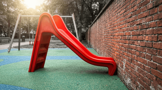
Slides are ramps. Ramps accelerate kids downward. Where does the kid go after hitting the bottom? If there isn’t another landing area, if the slide simply hits a solid object like a brick wall, a chain-link fence, or a metal post, then the destination is a concussion.
These photos illustrate some of the worst examples on r/CrappyDesign because they make you laugh and also make you worry about real kids. The design rule broken here is user flow: the path a person takes through a space needs to flow without obstruction. A slide that ejects a kid into a wall has zero user flow. It has user impact.
The Vibe List’s take: The wall-ending slide is the type of design fail that stops being funny the instant you envision a real kid sliding into it. This list includes it to mark the line where humor ends and negligence begins.
7. The Cancel and Confirm Buttons That Switched Places {#7}

You’re standing at an ATM. You’d like to confirm your withdrawal. The “Confirm” button is on the left side. All ATMs you’ve ever used have put “Confirm” on the right side. So you press the right button. You just cancelled your transaction. You begin again. You press the right button again. You cancel again. After you try to withdraw three times, the ATM swallows your card.
The principle at work is consistency. Users develop mental models based on prior experience. Since all ATMs, all dialog boxes, and all checkout screens put “Confirm” on the right and “Cancel” on the left, your brain automates that action. Switching those locations without visual warning is not clever design. It is sabotage.
The Vibe List’s take: What’s infuriating about the swapped-button fail is that it punishes you for being experienced. The better you are at using technology, the more likely this fail catches you.
8. The Wheelchair Ramp to Nowhere {#8}
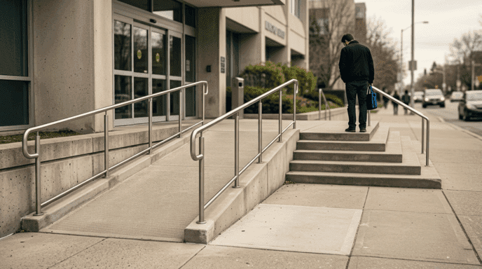
Someone built a wheelchair ramp with perfect slope. A wheelchair user follows that slope to descend gently to ground level. And it deposits them there; at the foot of a flight of stairs; with no elevator, no lift, and no other way to continue onward. The ramp exists. Accessible pathways do not. Somebody put the ramp there to meet a compliance requirement without once checking whether that ramp actually connected to an accessible pathway. The result is a piece of infrastructure that appears inclusive in a photo and functions as a dead end in practice.
The Vibe List’s take: The ramp-to-nowhere fail represents the difference between meeting a compliance requirement and providing actual accessibility. One is merely a checkbox on a form. The other involves a human being arriving safely at their destination.
9. The Crosswalk That Leads Directly Into a Pole {#9}
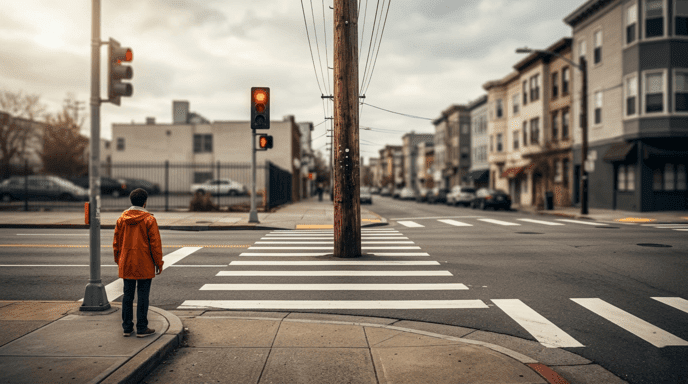
Crosswalk lines are painted on roads. They are straight. They are standard width. They direct pedestrians from one curb to another. However, one particular crosswalk runs directly through a utility pole installed in the middle of the sidewalk.
Two entities created this mess independently. Road crews paint crosswalks. Utilities crews install poles. Neither talked to the other. So pedestrians are directed along a path that meets both departments’ technical requirements, yet is physically impossible to walk.
The Vibe List’s take: The pole-in-the-crosswalk fail illustrates how government departments treat cities like spreadsheets rather than places where people walk. Each cell in the spreadsheet is accurate. The human walking into the pole disagrees.
10. The Faucet That Sends Water Over the Counter {#10}

Most sinks are too small for their faucets. Water shoots from the faucet over the top of the basin and lands on your pants. Examples of this failure have appeared in hotel rooms, restaurant bathrooms, and public restrooms worldwide, each time producing equal amounts of shock and familiarity.
Faucet pressure and basin geometry don’t match. Either someone installed a faucet too large for the sink, or the water pressure was set too high for the basin to contain. The fix is simple: lower the pressure, add an aerator, or swap in a faucet that fits the sink. Nobody who chose the faucet bothered to test it with the sink.
The Vibe List’s take: The overflowing faucet is probably the most relatable example of bad design on this list. We’ve all experienced it. No one has ever forgiven it.
11. The Children’s Toy With an Unintended Message {#11}

The internet is full of children’s toys and products whose design sends unintended messages through poor color combinations, unfortunate shapes, or bad molding. These images dominate design-fail communities because the contrast between childhood innocence and accidental absurdity is peak benign violation.
Nearly all of these happen because the design team didn’t review the product from enough viewpoints. A toy that looks perfectly fine from the designer’s intended angle can look wildly inappropriate when rotated, held upside down, or photographed from a child’s eye level. QA testing from a single angle will miss the angles the internet will inevitably find.
The Vibe List’s take: The unintentionally inappropriate children’s toy proves that the internet will always find the worst possible interpretation of your product. Always.
12. The Transparent Bathroom Door {#12}
You can find photos of glass or translucent bathroom doors in restaurants and hotels that leave occupants visible from bedrooms, hallways, or dining areas.
A few luxury hotels intentionally include glass bathroom walls that fog on command using smart glass. However, when the smart glass fails, or when guests don’t realize it exists, the occupant is suddenly on display.
The Vibe List’s take: A bathroom door has only one job: to provide privacy. Transparency is the opposite of that job.
13. The Bridge With Steps {#13}
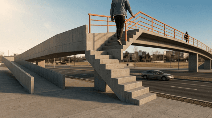
Pedestrian bridges exist to carry people over obstacles. When a bridge features stairs in addition to an existing slope, it creates another obstacle, becoming the very problem it was built to solve.
Images of pedestrian bridges with stairs mid-span; built over flat ground where a ramp would suffice; go viral constantly in design-fail communities.
The Vibe List’s take: This fail is self-explanatory. It is a solution that contains its own problem.
14. The USB Port Behind the Shelf {#14}

An electrician installed an outlet with USB ports at the correct distance, correct elevation, and with correct electrical connections. Then someone installed shelves, cabinets, or countertops directly over the outlet, completely obstructing access.
The outlet works. You will never use it.
The violated principle is spatial planning. Two teams made two correct decisions separately; placing an outlet and installing shelving; but together, the result is useless. Bad spatial planning is one of the most common reasons your home ends up looking cheap when every individual element seemed fine on its own.
The Vibe List’s take: The USB port behind furniture is what every group project has ever produced. Everyone did their part right. Nobody checked if the parts fit together.
15. The Staircase Ceiling That Guarantees Head Injuries {#15}
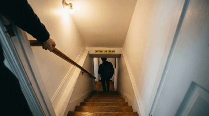
As stairs descend, so do you. As the stairs go down, the ceiling doesn’t follow; it stays where it was. For anyone taller than approximately 5’8″, the last three steps present a choice between ducking and a concussion.
Most local building codes specify a minimum of 6’8″ of vertical space from the top of the floor to the lowest part of any stairwell. Meeting the minimum passes inspection. But meeting the minimum doesn’t stop builders from placing sharp edges or low-hanging beams at the forehead height of a 6’2″ person. The code inspector passes it. Your forehead fails it.
The Vibe List’s take: The low-ceiling staircase is a design failure that leaves visible proof. While you may photograph other failures from a safe distance, you photograph this one while holding an ice pack.
16. The Sign That Says the Opposite of What It Means {#16}

“DON’T / GIVE UP”; that’s what one unfortunate line break produces. The intended message is “Don’t give up.” But your brain reads “Don’t” on one line and “Give Up” on the next, reading as two separate commands. The design fails here because the designer formatted text for visual appeal instead of readability. It’s one of the most common categories on r/CrappyDesign.
This illustrates the Gestalt principle of proximity. Proximity tells us that the closer elements are to each other, the more likely our brains are to group those elements together. And conversely, when elements are farther apart, our brains treat them as separate entities. So when a line break places “Don’t” and “Give Up” apart, the brain sees two separate messages. Good typography anticipates this. Bad typography leads to motivational posters that tell you to surrender.
The Vibe List’s take: The accidentally nihilistic sign is the ultimate design fail that proves typography isn’t decoration. It’s the difference between encouragement and an existential crisis.
17. The Electrical Outlet Inside the Shower {#17}
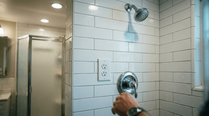
There is no charitable interpretation of an electrical outlet installed inside a shower. Installing an electrical outlet inside a shower violates building codes in every developed country. The National Electrical Code in the United States specifies exact distance requirements between outlets and water sources. An outlet inside a shower violates every single one of those rules.
When people post pictures like this on social media, it usually isn’t because they’re laughing. This is a design fail where the “benign” part of benign violation theory breaks down. An outlet in a shower is not a nuisance; it’s a potential electrocution hazard. If you laugh, it’s at the sheer absurdity that someone installed this and walked away.
The Vibe List’s take: The shower outlet represents the design fail that walks right up to the edge of comedy before crossing into serious danger. It’s included here because it went massively viral. But unlike other examples, it gets a completely different reaction: not laughter, but alarm.
18. The Balcony Door That Opens Into Thin Air {#18}
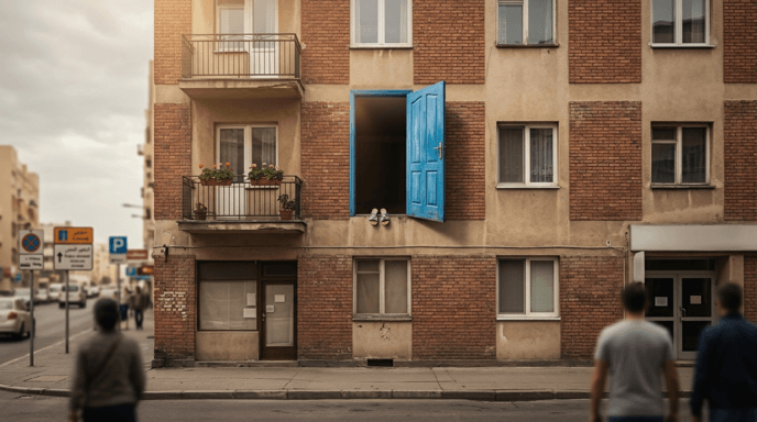
A door on the third floor of a building opens outward. On the other side: nothing. No balcony. No landing. Just air and a multi-story drop to the ground. Besides being completely non-functional as a doorway, the door is a serious danger to anyone inside.
Construction sequencing errors created these doorways. Builders install doors early in construction, before balconies and railings go up. When the building is finished, contractors or developers sometimes cut balconies to save money. However, while removing the balcony, nobody removes the door that accessed it.
The Vibe List’s take: This design fail shows how one construction shortcut becomes a permanent danger. Budget cuts deleted the balcony. Nobody deleted the door.
19. The Fire Escape Ladder Bolted Shut {#19}
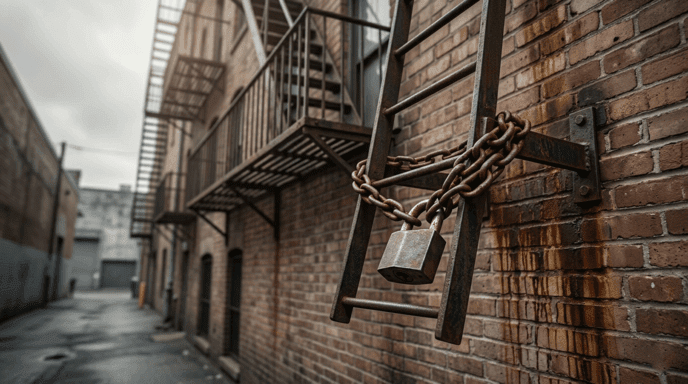
Fire escapes serve one primary function: letting people escape burning buildings. When you lock a fire escape ladder with chains or padlocks, you eliminate the escape route and replace it with a decorative barrier against theft.
Sealed fire escapes appear on both design-fail sites and building-safety violation databases. In many jurisdictions, locking or sealing a fire escape counts as a criminal offense, not merely a violation of building codes.
The Vibe List’s take: The bolted fire escape is not funny. It is the design fail that reminds you these collections are not just entertainment; some design failures have irreversible consequences.
20. The “Le Tits Now” Holiday Sign {#20}

Kerning refers to the horizontal spacing between individual letters within a word. When properly executed, kerning produces readable output such as “LET IT SNOW.” When improperly executed, kerning turns it into “LE TITS NOW”; a wildly different wish.
This image went viral and has been shared across social media and cable TV for years. The sign itself is real and the kerning is catastrophic. It has been featured in design-fail roundups for over a decade and is one of the most iconic kerning disasters ever documented.
The Gestalt principle of proximity strikes again. Your brain groups elements that are spatially close together. And it treats distant elements as separate units. When wide gaps fall between the wrong letters, our brains naturally regroup those letters into whatever combination the spacing suggests, even if that combination is wildly inappropriate for a holiday decoration.
The Vibe List’s take: “Le Tits Now” is the design fail that spawned countless gift mugs. It is harmless, endlessly fun to share, and a perfect example of how thin the line is between festive cheer and hilariously inappropriate humor: approximately three millimeters of letter spacing.
Why Your Brain Can’t Stop Laughing at These {#why}
The reason you laugh at these twenty design fails; and the reason design-fail content generates billions of views annually; comes down to a collision between expectation and reality that your brain processes as safe.
Peter McGraw and Caleb Warren’s benign violation theory, published in Psychological Science in 2010, provides the framework. Every design fail on this list satisfies the theory’s three conditions.
First: our expectations are violated. A door should be intuitive; a slide shouldn’t end in a wall; a fire escape should open.
Second: the violation is perceived as benign. You are viewing photographs. Nobody is getting hurt in front of you. The absurdity signals safety.
Third: both perceptions occur simultaneously, producing laughter.
McGraw and Warren also explain why some fails on this list produce less laughter and more alarm. The theory predicts that humor decreases when violations become too severe. A sign with bad kerning is funny. An electrocution hazard is not. When the “benign” condition weakens; when you can imagine someone actually getting hurt; the humor response decreases and the threat response increases.
There is also a social dimension. Sharing design fails is a form of collective superiority, not over the person who installed the parking meter, but over the entire chain of decisions, approvals, and institutional failures that produced a solar panel underground. That chain is impersonal enough to mock freely, which is why design-fail humor feels so universally acceptable.
Dr. Samuel West, the clinical psychologist who founded the Museum of Failure in Helsingborg, Sweden, in 2017, has built an entire exhibition around normalizing failure. As he told Smithsonian Magazine, “People feel liberated when they see big well-known brands and companies that have extreme amounts of money and skills and experience and they still fail when trying new things.” The Museum of Failure has featured over 150 failed products and has traveled to New York, Los Angeles, and multiple international cities.
Design failures are not only comedic material. They provide insight into how systems break down: communication gaps between departments create crosswalks leading into poles; cost-cutting eliminates balconies but does not remove doors opening onto them; and the human tendency to blame ourselves for poor design is actually the wrong response to such problems.
Next time you push a door that should have been pulled, remember: it is not you. It is the door.
Quick Reference Summary Table
| # | Design Fail | What Went Wrong | Design Principle Violated | Where It Went Viral | Danger Level |
|---|---|---|---|---|---|
| 1 | The Norman Door | Handle says “pull,” sign says “PUSH” — affordance contradicts required action | Affordance (Don Norman) | Vox / 99% Invisible (10M+ YouTube views) | Harmless — just embarrassing |
| 2 | Solar-Powered Underground Parking Meter | Solar panel installed where sunlight never reaches | Contextual Appropriateness | r/CrappyDesign (thousands of upvotes) | Harmless — just useless |
| 3 | Scissors in Scissors-Proof Packaging | Clamshell packaging requires scissors to open — but scissors are inside | Supply Chain Communication | r/CrappyDesign, Bored Panda | Harmless — philosophical paradox |
| 4 | The Bench That Stabs You | Protruding bolts, sharp edges, or hostile architecture dividers | User Comfort / Hostile Architecture | r/CrappyDesign, r/HostileArchitecture | Moderate — physical discomfort |
| 5 | American Bathroom Stall Gap | Wide gaps between door and frame expose occupants | Privacy / Cost-Cutting Culture | International travelers, Reddit, meme culture | Harmless — just mortifying |
| 6 | Playground Slide Into a Wall | Slide ejects children directly into a brick wall | User Flow | r/CrappyDesign | High — concussion risk |
| 7 | Swapped Cancel/Confirm Buttons | “Confirm” and “Cancel” positions reversed from universal standard | Consistency (Interface Design) | r/CrappyDesign, r/assholedesign | Harmless — ATM may swallow your card |
| 8 | Wheelchair Ramp to Nowhere | Ramp deposits wheelchair user at foot of stairs with no alternative path | Accessibility Compliance vs. Reality | r/CrappyDesign, accessibility advocacy communities | Moderate — exclusion hazard |
| 9 | Crosswalk Into a Pole | Crosswalk painted directly through a utility pole | Interdepartmental Coordination | r/CrappyDesign, r/NotMyJob | Moderate — pedestrian collision |
| 10 | Faucet That Overshoots the Sink | Water pressure launches water over the basin onto your pants | Spatial Planning (Pressure vs. Basin) | r/CrappyDesign, hotel review sites | Harmless — just wet |
| 11 | Children’s Toy With Unintended Message | Poor molding or color choices create inappropriate visual from certain angles | Multi-Angle QA Testing | r/CrappyDesign, Bored Panda, BuzzFeed | Harmless — peak benign violation |
| 12 | Transparent Bathroom Door | Glass door provides zero privacy; smart glass fails or is unknown to guests | Core Function Failure (Privacy) | Reddit, hotel review platforms | Harmless — maximum embarrassment |
| 13 | Bridge With Steps | Pedestrian bridge includes stairs, becoming the obstacle it was built to solve | Self-Defeating Design | r/CrappyDesign, design-fail roundups | Moderate — accessibility barrier |
| 14 | USB Port Behind the Shelf | Outlet installed correctly, then furniture placed directly over it | Spatial Planning / Coordination | r/CrappyDesign | Harmless — just inaccessible |
| 15 | Low-Ceiling Staircase | Stairwell ceiling too low for anyone over 5’8″; code-compliant but injurious | Code Compliance vs. Real-World Safety | r/CrappyDesign | High — head injury risk |
| 16 | “DON’T / GIVE UP” Sign | Line break turns “Don’t give up” into two commands: “Don’t” and “Give Up” | Gestalt Principle of Proximity | r/CrappyDesign, social media | Harmless — accidentally nihilistic |
| 17 | Electrical Outlet in Shower | Standard outlet installed inside a shower stall, violating every electrical code | Safety Code Violation (NEC) | r/CrappyDesign, safety forums | Severe — electrocution hazard |
| 18 | Balcony Door to Thin Air | Door opens outward from upper floor onto nothing; balcony cut from budget | Construction Sequencing | r/CrappyDesign, building-safety databases | Severe — multi-story fall risk |
| 19 | Fire Escape Bolted Shut | Fire escape ladder padlocked or chained closed | Safety Function Elimination | Design-fail sites, safety violation databases | Severe — criminal offense in many jurisdictions |
| 20 | “LE TITS NOW” Holiday Sign | Bad kerning turns “LET IT SNOW” into “LE TITS NOW” | Gestalt Principle of Proximity / Kerning | Social media, cable TV, gift mugs worldwide | Harmless — endlessly shareable |
Frequently Asked Questions {#faq}
Why are bad designs so funny?
The benign violation theory, developed by Peter McGraw and Caleb Warren at the University of Colorado Boulder, explains that humor occurs when a situation violates your expectations of how things usually work, the violation is perceived as harmless, and both perceptions happen at the same time. Design fails satisfy all three conditions: they break expectations of functionality without creating any risk to the viewer.
What is a Norman Door?
A Norman Door is any door where the design gives users a confusing signal about whether to push or pull. The term was coined based on the work of cognitive scientist Don Norman, who discussed counterintuitive doors in his 1988 book The Design of Everyday Things. Norman Doors persist because architects often prioritize aesthetic appeal over usability, requiring signs to compensate for design failures.
Where can I find more design fails online?
The largest online community for design fails is r/CrappyDesign on Reddit, which has approximately 6 million members. Related communities include r/onejob, r/assholedesign, and r/NotMyJob. Bored Panda publishes curated collections regularly, and Pleated-Jeans runs weekly design-fail roundups.
Is there a museum dedicated to design failures?
Yes. The Museum of Failure was founded by clinical psychologist Dr. Samuel West in 2017 in Helsingborg, Sweden. It has since become a traveling exhibition featuring over 150 failed products and design decisions from major brands, including New Coke, Google Glass, and Colgate’s frozen lasagna dinner. As of 2023, it exhibited in New York City at Industry City in Brooklyn.
Why do American bathroom stalls have gaps?
American bathroom stalls have gaps between partitions and doors due to a combination of cost savings, building code ventilation requirements, ease of maintenance, and longstanding manufacturing standards that nobody has updated. Most other developed countries use floor-to-ceiling partitions with no gaps, making the American design an outlier.
How does the Gestalt principle of proximity affect sign design?
The Gestalt principle of proximity states that the human brain groups visual elements that are close together and separates elements that are far apart. In sign design, poorly placed line breaks or letter spacing can cause readers to misread words by grouping letters incorrectly. Poor kerning, for example, can turn “LET IT SNOW” into “LE TITS NOW” when gaps fall between the wrong letters.
This content is for entertainment purposes. If you encounter a design failure that poses a genuine safety hazard, such as a blocked fire escape or exposed electrical wiring near water, report it to your local building safety or code enforcement authority.
